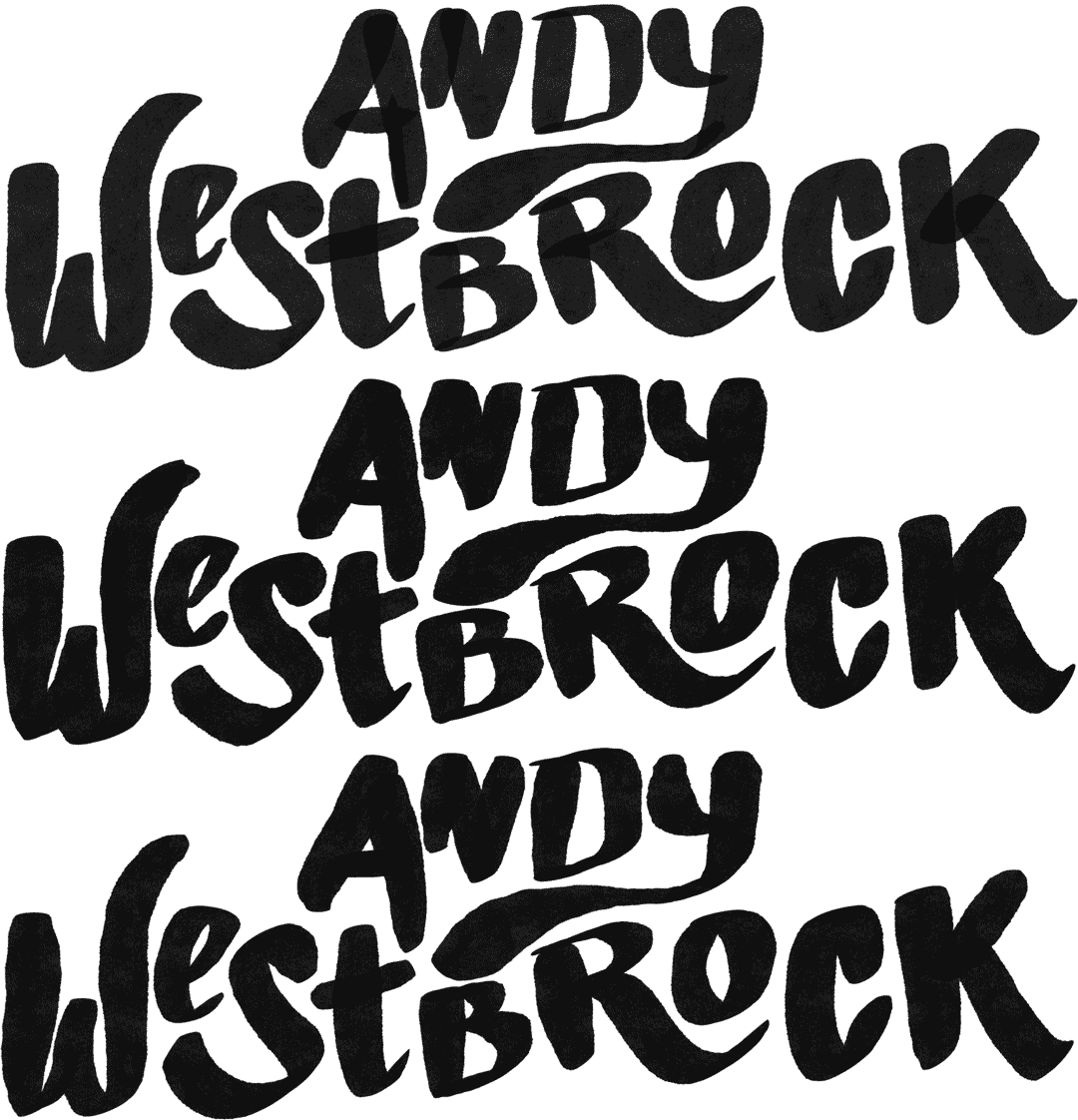
I’ve been wanting a new logo for myself for quite sometime, so yesterday I just sat myself down and cranked one out. Bam. There you go.
It’s based off an icon I had been using for myself for a little while that always seemed fitting, but wanted something that was a little more fitting and striking. Obviously the “A” and “W” come from my initials, but the gear always seemed to be a nice representation of my hardworking, Midwestern roots. And the orange, black and white are a nod to my hometown and the school colors back in good ol’ White Bear Lake, MN. One should never forget where you come from.

